Ideas & systems
Colours and shapes
The Tailor keeps one bolt of cloth per game. Every panel, card and button is cut from it.
What it is
A theme is the set of colours, borders and corner roundings a game uses for its screens. It belongs to the whole game. Change a colour once and every panel, card, button and tab that uses it changes with it.
The theme sorts its colours into groups, one for each kind of surface.
| Group | What it paints |
|---|---|
| Panels & cards | Panels, modal windows and item cards, with their text |
| Menus & popups | The menus that slide in, popovers, and the dimmer behind them |
| Buttons | Buttons, the round icon buttons and their symbols |
| Tabs | The tab bars of menus, and the selected tab |
| Screen labels | Labels on the HUD, and the outline around HUD icons |
You can also pick a font for the game. Without one, the game uses its default font.
How it works
You set the theme in Edit Mode, with the same rule as the HUD: change it, look at the game, undo it if you do not like it.
- Open the HUD surface. Choose Edit this Game in the game menu, then HUD in the top bar.
- Open Look & feel. In the Add to the screen panel, the palette button with the title Look & feel opens a panel with two tabs, Colours and Menus.
- Pick colours. The Colours tab lists 19 colours in the five groups above, then a Font row that reads "The game's default" with a Choose… button. Each colour is a swatch. The game changes at once.
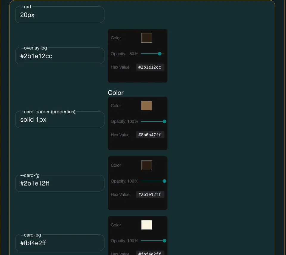
- Reach everything else. Borders, corner rounding, outline thickness and the hover effects are not in this panel. They live in the full theme editor, the UI page of your game's admin pages. (The link Open the full theme editor at the bottom of the panel is meant to go there, but today it reloads the app instead.) In the full editor where each colour has an opacity slider and each border has a style and a colour.
- Undo. Each colour change is a step in Undo and Redo.
The first change of a session opens a Heads up box, because editing refreshes the game. Choose CONTINUE.
In Vespera
In Vespera: Parchment and ink, then back to the default Play it
Vespera tried a theme of parchment and ink with the Ledger's gold, then went back to the engine's own look because the menus read less clearly. Vespera sets no theme of its own now.
The trial used these colours:
- Panels and cards were cream (#F3E9D2 and #FBF4E2) with ink text (#2B1E12).
- Buttons were the Ledger's gold (#E8B923) with ink text.
- Borders were a thin sepia line, solid 1px #8B6B47.
The look Vespera has now is the engine's own: dark teal panels, white text and teal buttons. The full list is in Theme colours.
Good to know
- Check contrast. Text must still read against its background. Aim for at least 4.5 to 1 for body text.
- The full editor saves the whole theme. Opening it and saving writes every setting it lists, including ones you did not touch.
Under the hood
- A theme is a list of named settings stored as one block on the game. Each setting has a name that starts with the part it paints, such as panel, card, menu, popup, button, tab or screen label.
- A game's own theme is laid over the engine's built-in defaults. A setting you leave out keeps the default, so a half-finished theme never breaks a panel.
- A colour you pick in Edit Mode keeps the see-through part of the old value. This matters for the screen dimmer, which is meant to be partly see-through. A plain colour picker would otherwise turn it solid.
- A change in Edit Mode is merged into the stored theme. It never rewrites the whole list, so borders and corners set in the full theme editor survive.
- Border settings must stay valid border shorthand, a style, a width and a colour, or the border is dropped.
- Edit Mode's own chrome does not use the theme. Your changes show on the game, not on the editor around it.